–Croix Bleue
A travel and health insurance
in Canada.
At Accenture Interactive we were supporting Croix Bleue on 3 areas: the paid media strategy and execution, the SEO and the UX.
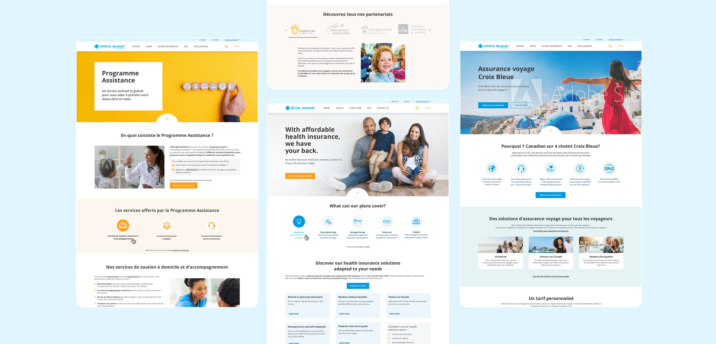
For the UX mandate the first step was to improve the site navigation by organising a card sorting workshop with the client team. We then created a style guide to form the foundations of the user interface in order to optimize the site for all devices.
For a couple of months, alongside the SEO team we supported the client on the optimization of landing pages. The goal being to optimize the layout and content to be as relevant as possible for users


–Redesigning the homepage
In 2019 Croix Bleue went through a brand repositioning campaign with an external agency. They had developed a new slogan that translated into “Your life is your lifework”. The goal was to position the Blue Cross has a partner, that has its community at heart.
So Croix Bleue came to us with a draft made by the other agency reflecting that new brand positioning.
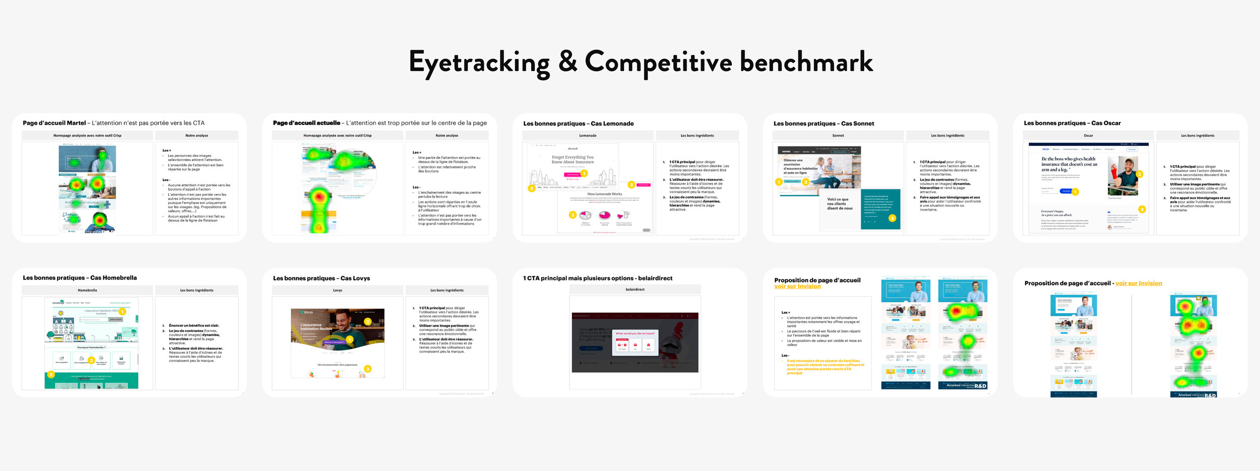
To help them redesigning the homepage we have used two different tactics to base our decision on. First we built a competitive benchmark analysing the website of 8 different companies within the same area to come up with a list of the best experiences and practices.
Then we used an eye-tracking tool called Crisp to analyze the user’s eye movements across the interface. We ran the tool on their draft, their current home page and on a couple of propositions in order to choose the one that seemed the most effective.
–Adapting in the time of Covid-19
During the period from March 2020 to May 2020 the company had to adapt and make a couple of business changes due the health crisis. As the core of their business was travel insurances they had to make a turnaround and put their focus on the health insurances.
So of course we had to help them adapting.
One of the mandate was to help them promoting their new service: EQ Care a virtual healthcare service.
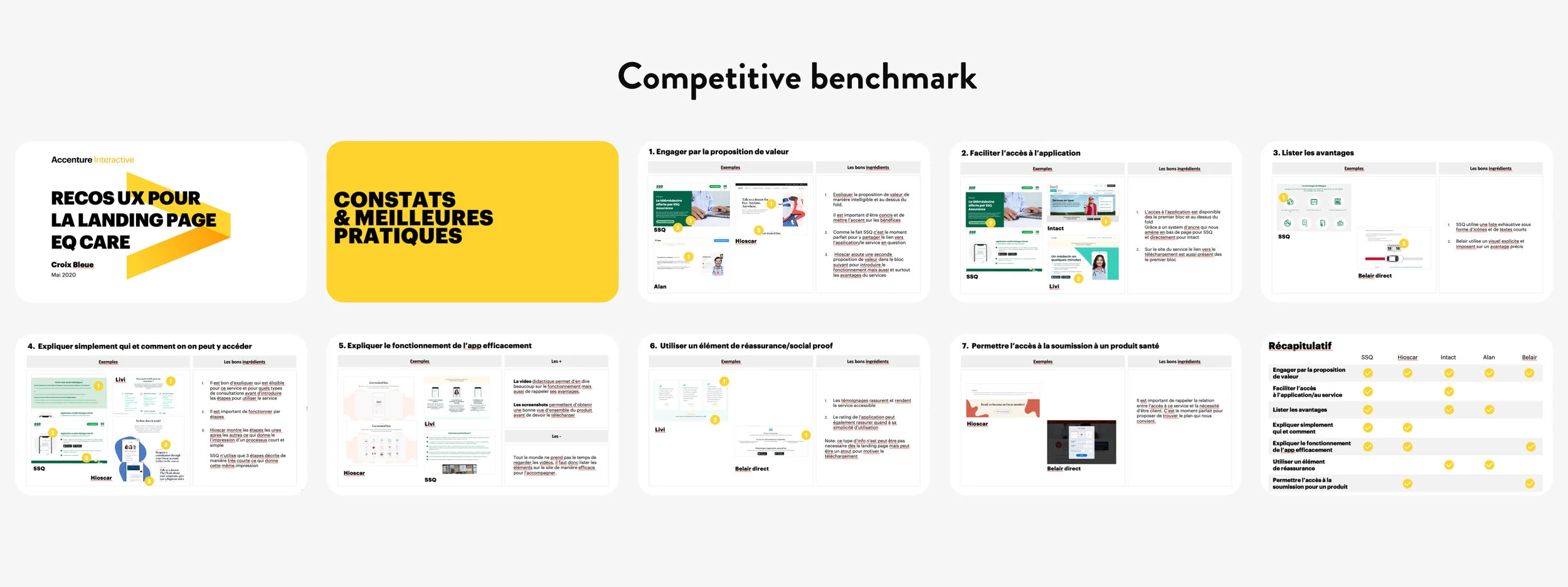
So first we built a short competitive benchmark analysing competitors’ websites in order to list 7 best practices to help them creating a new landing page.
Then we help them by designing the page with both micro copy and asset creation. All this based on the style guide and page templates we were already using.


